Comparing the Design and Effectiveness of Three Nonprofit Web Sites
Annette Frahm and Linda Jacobson
We are comparing three sites: Washington Conservation Voters, Open Secrets and LiveStrong
Visual Design: Similarities, Differences, Effectiveness
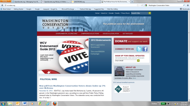
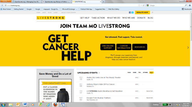
The two political sites (Washington Conservation Voters and Open Secrets) share some similarities: patriotic colors of red, white and blue, but with a focus on blue (think calm). In contrast, the dominant color of LiveStrong is yellow, perhaps meant to be cheerful.
Washington Conservation Voters has a clean, simple design. Pages vary between two and three columns with a simple sans serif typeface.
Open Secrets’ page format varies quite a bit among pages. Even the typeface changes. It doesn’t seem to be developed on a consistent grid. The variation in styles is a bit distracting.
Both of the political sites prominently display a request for donations. Both have a red bar that holds categories and both provide the ability to search within the site. Both provide a way to take action/get involved.
LiveStrong has a simple color scheme: black and yellow on white. The brightness is a bit jarring. The site seems very busy and the color scheme is not easy on the eyes. The dropdown menus are very large, sometimes with as many as four columns. The amount of information is almost overwhelming. LivingStrong also has a donate button, but it is not as prominent as on the political web sites.
What is Success?
We define success as the ability to find the information you are looking for. A successful web site is visually pleasing, is easy to navigate and functions as expected. Information searched or links click respond quickly. You are not left wondering what is going on or waiting. If there by chance is an issue, the site needs to be smart enough to let you know what is going on and either provide your assistance to refine your search or provide a way for you to get assistance.
Overall, all three nonprofit web sites are effective in that they are providing pertinent information to their organizations’ missions. Below is our in-depth analysis and recommendations.
Competitive Analysis
| Categories | Washington Conservation Voters | OpenSecrets.org | Livestrong |
| Color | Blue surround, blue header, red bar, donate button, blue text on white background | Light gray surround. Top bar with logo in red and blue, red bar with categories, blue text on white background | White surround, yellow logo with black text, yellow strip bar with black text, content black text on white background |
| Donate | Prominent donate button, white text on red background | Prominently placed donate button | Donate button in upper right hand corner, but not placed prominently on page |
| Sections/Categories | Home About Us Donate Events Press Room (all on top of page)Environmental Scorecard / Campaigns & Elections / Issues & Legislation / Get Involved | About Us (on bottom of page)Politicians & Elections / Influence & Lobbying / News & analysis / Resources / Take Action / About Us / Donate | Home Shop Blog Login Select your Country (all on top of page)Get Help / Take Action / What We Do / Who We Are / Donate / Blog |
| Sign up for Updates | On main page, on right side, above the fold | On main page, left side, below the fold | Not located on main page |
| Social Media | Twitter, Facebook (on main page, above the fold, prominent) | RSS, Twitter, Facebook, YourTube, Tumblr (on main page, below the fold) | Facebook, Twitter (below and above the fold), Flickr, YouTube,(below the fold) Blog and newsletters Under More, on bottom of page |
| Search | Upper right corner, main page above the fold | Top left corner, main page above the fold | No search |
| Data | Search capability, but quality and quantity of data is missing. | Tons of information, difficult to digest. Need to provide small nuggets that quickly summarize data. | A lot of information, but difficult to find. |
| Navigation | Easy to navigate | Needs a home button | Lot of duplicate data; needs a search function |
Washington Conservation Voters
Scenario
It is the week before the 2012 election. John is 25 and lives in Seattle. He has an entry-level professional job and is involved in local environmental issues. He is interested in statewide politics but isn’t familiar with all of the candidates and their views on issues that matter to him. He goes to the web site to figure out who he should vote for besides the obvious choices of governor, senator and representative. He stumbles across Washington Conservation Voters; he’s heard favorable things about the organization from people he has worked with on environmental issues. He clicks on lieutenant governor and reads the descriptions of Bill Finkbeiner and Brad Owen. He is impressed by the description and endorsement of Finkbeiner and decides to vote for Finkbeiner. He also reads the description of the judges, but doesn’t think there is enough detail about the candidates to help him decide. Some races only list one candidate; is only one person running for the judge position? He isn’t sure he can trust the endorsements of an organization he doesn’t know well that isn’t providing all the information he needs. He decides to find another web site to help him make a decision and leaves the site.
What is “success?”
Success is John staying on the site and finding the information he is looking for. Since this did not happen, the site Washington Conservation Voters has failed its mission.
Analytical summary: Do’s and don’ts
The Washington Conservation Voters web site provides useful information that is easy to find. The site should continue to provide endorsements of candidates and environmental score cards for elected officials. It should also continue to provide updates on issues during the legislative session; this could be very useful for people following issues they care about. However, the site also lacks some important details, such as the judicial candidates mentioned above. The team supporting the site needs to include more robust content to better meet the needs of its audience. Navigation is working well and social media is easy to find.
Scenario
Carol is a politically active student writing about the candidates in the 2012 election. She is following the candidates closely. A recent topic in class suggested the importance of “following the money.” In an effort to better understand the candidates’ platforms, Carol is doing just that, following the money. As she peruses the Internet, she discovers OpenSecrets.org, a site dedicated to tracking the money spent in US politics. She thinks she hit the mother lode as page after page promises to deliver the data. As Carol starts to click on links, she is annoyed by the drop down lists and is having a hard time finding exactly what she is looking for. Yes, there is a lot of information, but also a lot of empty promises. Information that does not seem pertinent is also included. She thinks it might be better to go find another site. She longs for a simple explanation, analysis that would help her better digest all the information the site has to offer.
What is “success?”
As measured by our criteria for success, OpenSecrets.org fails. While offering a plethora of data, the information is hard to digest. If OpenSecrets.org provided smaller bits of information that helped its audience better consume the information it provided, this would help make the site successful.
Analytical summary: Do’s and don’ts
A record amount of money was spent in the 2012 election. OpenSecrets.org plays an important role in providing information about where the money comes from and where it goes. However, the Center for Responsive Politics needs to organize the plethora of information on the site so that it is accessible in smaller bits. The big picture about the role of money in politics gets lost in the enormous amount of detail on the site. The site would benefit by organizing pages to give summary information up top, so people could find important information by skimming, with details further down on the page. That would help its audience better absorb and understand campaign financing.
Personas
1. Jane has cancer and wants to better understand what she is dealing with and read about cancer survivors; get strength from cancer survivors / how can I beat this from people who have survived
a. Jane is in her 40’s
b. Jane is a mom
c. Jane has an active life and that is why she is going to this site vs others (such as American Cancer Society)
2. Sam is a bicyclist and always admired Lance Armstrong and his recovery from cancer and winning the Tour de France
a. Sam is trying to decide if he should give $$ now that Lance has resigned
b. Sam is 35
c. Sam is very active and has done triathlons
3. Jenn is a runner
a. She is 30 and interested in events that LiveStrong sponsers
b. Her mother and father/relative that have had cancer
c. She wants to support her relatives and friends that have had cancer by entering and raising $$ for an upcoming event
Scenario
Jane wants to better understand her cancer. She clicks on Get Help and then looks at the Physical Effects under Learn about Cancer. Jane is overwhelmed by the list and somewhat demoralized. So she clicks back to Learn about Cancer and finds Survivor Interviews. Watching the videos and reading the transcripts make her feel better, less alone. She identifies with one woman in particular and finds hope in her story. She bookmarks the site to come back to again and sleeps a little better that night.
What is “success?”
The LiveStrong web site provides a lot of useful information, but it is overwhelming as you start to look through the information. You may or may not have a successful experience, depending on where you started looking. There is no search to help you better navigate and go direct to information you may be looking for.
Analytical summary: Do’s and don’ts
LiveStrong offers a wealth of information that could be useful to someone diagnosed with cancer, from one-on-one support to stories of people who have had cancer. If a visitor to the site begins by clicking on the drop-down menus, the amount of information is overwhelming. The menus have two, three and even four columns, difficult to absorb. On the other hand, if a visitor begins by clicking one of the boxes on the “Get cancer help” yellow bar, he or she is more likely to find an appropriate page. Some of the internal pages are better organized than others. Some have a sea of text that isn’t broken into absorbable bits; others have headlines and subheads with short descriptions that take the visitor to another page. The site would be much more useful if it had a search function.


You must be logged in to post a comment.